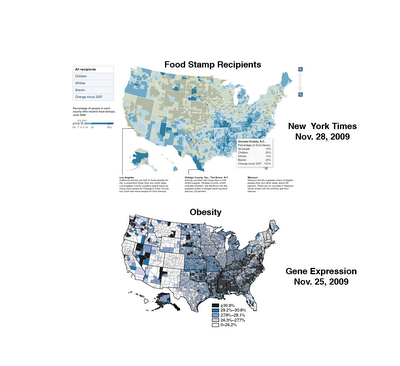
Since The New York Times put up the csv file which they used to generate their maps of food stamp usage, I thought I’d look at the data a little closer. In particular, look at this graphic of change in food stamp usage by county (dark equals more usage):
I was curious about this part from the story below::
While use is greatest where poverty runs deep, the growth has been especially swift in once-prosperous places hit by the housing bust. There are about 50 small counties and a dozen sizable ones where the rolls have doubled in the last two years. In another 205 counties, they have risen by at least two-thirds. These places with soaring rolls include populous Riverside County, Calif., most of greater Phoenix and Las Vegas, a ring of affluent Atlanta suburbs, and a 150-mile stretch of southwest Florida from Bradenton to the Everglades.
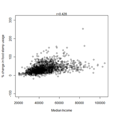
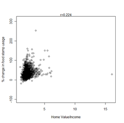
Thanks to the Census I happen to have 2007 housing value and household income data. Also though it would be interesting to compare with obesity and diabetes rates. Scatterplots & correlations (r) below.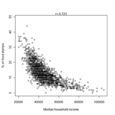
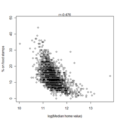
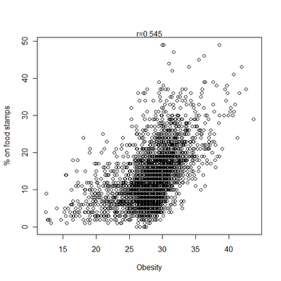
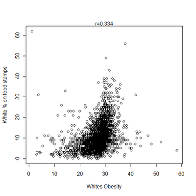
It does indeed seem that food stamp usage has been increasing in higher income and property value counties. The Census data I used above were collected between 2005-2007, during the height of the late great property bubble. But when I took the ratio of property value by income as a rough proxy for being over-leveraged it didn’t seem to add much.
When I took the partial correlation of home value and increase in food stamp usage controlling for income, it was only 0.11. Here are some other correlations controlling for income:
% on food stamps – obesity = 0.33
% on food stamps – diabetes = 0.44
% of whites on food stamps – white diabetes rates = 0.36
% of whites on food stamps – white obesity rates = -0.05
There’s an obvious correlation between black proportion in a county and food stamp utilization. r = 0.43. So using proportion of blacks as a control:
% on food stamps – obesity = 0.43
% on food stamps – diabetes = 0.51
% on food stamps – white diabetes rates = 0.43
% on food stamps – white obesity rates = 0.06
% on food stamps – median household income = -0.71
It does seem to be correct though that food stamp utilization has been shooting up in more affluent communities. But if it is true that well over 90% of those eligible in places like Missouri are already using food stamps, while only 50% of those eligible in California are, it makes a bit more sense. In wealthier communities likely more people go in and out of eligibility and so never need to make recourse. In contrast, in regions where people are immobile and poverty is chronic there isn’t as much scope to increase the program because most people who are eligible are already on it. That probably explains the triangular geometry of the scatterplot, very low on the affluence latter social services seem to have soaked up all eligible individuals, leaving little room for increase with the recession.
Note: Estimates are white obesity are based on state level variation. Estimates of white diabetes rates are based on national level variation. These two variables need to be appropriately down-weighted in terms of confidence of their accuracy, especially the second.
Update: By coincidence, a reader noted this similarity of maps this morning: