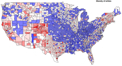
Since it’s after Thanksgiving and I’m feeling bloated, I figure a follow up to the post on obesity and diabetes might be apropos. I want to focus on obesity. I have the raw county-by-county data, but obviously it isn’t broken down by race. But, I do have the proportions for reach race by county, and, the CDC provides state-by-state breakdowns of the proportion of obese by race. So I decided to “estimate” the proportion of whites obese by county.
1) By “white,” I mean “Non-Hispanic white.” I’m going to say “white” from now on exclusive of Hispanics.
2) Some states, such as Vermont, do not have a large enough sample to estimate the obesity proportion of blacks. I just used a neighboring state to fill in the numbers. This guesstimate is really not much of an issue because the proportion of blacks is so low in the states I had to estimate that the estimate of obesity for whites and estimate of obesity for all races is the same in these counties anyhow.
3) Simple algebra. Total Obesity Percent In County = (Obesity Percent Whites) X (Percent Whites) + (Obesity Percent Blacks) X (Percent Blacks) + (Obesity Percent Latinos) X (Percent Latinos)
For the obesity percent of blacks and Latinos I only have state level data, so this is going to be a rough estimate. And it’s going to result in the variation exhibiting state-to-state discontinuities, since the county variable is dependent on a state level variable. Also, I discarded some counties where the usage of state level data caused really big distortions. Along the Mexican border Latinos are not nearly as obese as they are further into the United States, so I end up with numbers where whites have negative obesity percentages to make the math work out. These are counties which are 90% or more Latino with relatively low obesity numbers.
I did the map shading the way I normally do. Blue is above the median value, and red below the median value, with the scale being set to their max and mins respectively. Unfortunately this causes a problem in the scaling in terms of an asymmetry because one side of the distribution will tend to have a more extreme outlier (usually the above median is where the skew is).
Here’s the map with all the populations:
This is basically the earlier map except shaded differently. Here are the summary statistics for obesity by county:
min = 12.40
1st quartile = 26.60
median = 28.40
mean = 28.25
3rd quartile = 30.20
max = 43.70
Now for my estimate of whites only:
As you can see, the use of state level is causing some distortions. Also, you see something peculiar in the summary statistics:
1st quartile = 25.54
median = 27.62
mean = 26.71
3rd quartile = 29.47
max = 58.11
These averages don’t align with the CDC values aggregated. But that’s because I’m looking at county level data, and not weighting by population. Lots of low density counties with few people have many obese people. Instead of looking at national averages, we’re looking at regional variations.
On the estimates, Texas probably jumps out at you. To my surprise it turns out that whites in Texas are a touch lighter than the national average for whites! For me the big thing that sticks out is that Appalachia seems to be split in two, along the Appalachian Trail (I feel funny mentioning the Appalachian Trail….). Some areas, such as New England, Colorado and California do not surprise in terms of whites who are below the national median. But again there is a pattern of some pockets in the Upper Midwest being relatively under the norm in the proportion of obesity. Some of you might be surprised by the Pacific Northwest, but this region is characterized by urban-rural polarization.
What are the correlations by ethnicity? Here are the correlations with white obesity in terms of ancestral proportion (the proportion of ethnicity X as a proportion of whites):
English = -0.17
German = -0.02
American = 0.07
Scots Irish = -0.13
Irish = -0.19
These are very modest correlations. Probably mostly explained by geography. How about voting?
Obama vote = -0.21
Again, modest. Median Family Income? Only -0.14! That surprised me. Interestingly, Median Home Value had a -0.26 correlation with obesity. Of course the “Dirt Gap” tracks this; in places where people are thinner property values are higher, and rose higher in the past decade. The proportion who have a college degree is like home value, a correlation of -0.25.
None of this is really surprising, on the aggregate level you know that wealthier and more educated people are thinner. So I might as well do something that’s not totally predictable. Most of the variance of obesity on the county level isn’t predicated by educational levels, but a non-trivial fraction is. I decided to fit a loess curve to the plot of obesity (white) who are college educated. Then I simply took the residuals above and below the line and shaded them blue and red respectively. In other words, blue areas have a lot of fat people for the number of college graduates, while red areas have relatively few fat people for the number of college graduates.

